Well, kind of.
One of the absolute most difficult things to do in online marketing is to write and create a sales page.
If your sales page sucks, you’re going to miss out on a ton of sales. You’ll pull your hair out wondering where you went wrong and why no one wants to buy.
That part is not fun.
But, if you put some time, effort, and planning into building a killer sales page it can make all the difference in the world. You’ll get new customers, make money, and be well on your way to the lifestyle of your dreams.
Simple, right?
Well, not quite, but that’s what this post is for. In it, we’re going to share everything you need to know to start creating a sales page that converts.
This is a bit of a monster post, so you may want to grab a coffee or a beer and settle in because if you’re new at creating a sales page for a product or service you’re offering, this should be one of the only posts you’ll need.
Here we go.
Table of Contents
What is a sales page (and why they are important)?
This might be the shortest definition you’ll ever see in online marketing. What’s a sales page? It’s a page dedicated to making sales.
Yup, it’s pretty much all there in the name.
What you don’t want to do is confuse a sales page and a landing page since they are kind of similar. A sales page is all about getting people to buy that’s its one and only purpose.
Whereas a landing page, while it also has one goal, is focused around getting people to take a specific action singing up for your newsletter or downloading an ebook, for example. Landing pages usually have short copy, a punchy headline, and some sort of opt-in feature.
Sales pages can long (like really long) or short with lots of headlines and features but the call to action is always going to be some form of asking people to buy.
Sales pages are important because every brand needs to make sales. In online marketing, sales pages are pretty much the most effective way to do that. Most people aren’t going to just land on your blog and decide they are ready to buy whatever you’re selling, they need a bit of convincing. That’s where the sales page comes in.
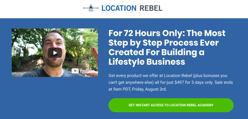
A well-designed sales page gives you the chance to highlight your product or service, tell a story, overcome objections, and share the successes of previous customers all while asking for the sale.
If you want to sell anything directly on your site you need to have a sales page. And more importantly, you need to have a sales page that converts readers into customers.
How to Create a Sales Page: Before You Start
I know you’re ready to put on your copywriter hat and dig in, but hold your horses for a minute. Before you type a single word of your sales page there are things you have to do first. Very important things that are going to help make your sales page better.
Skip these and your sales page is going to be clinging to a life raft before you’ve even started.
Join over 40,000 people who have taken our 6 part freelance writing course. Sign up below and let’s do this together.
By entering your email address you agree to receive emails from Location Rebel. We'll respect your privacy and you can unsubscribe at any time.
How to Research for Your Sales Page
Before you even think about actually creating a page, you have some research to do.
You need to know the answers to these questions (hint: the answer is not everyone):
- Who is going to buy the product?
- Why will they buy it?
- How much are they willing to pay?
- What is going on in their head while they’re considering buying it?
If you don’t have answers to all of these questions, then you still have a lot of work to do.
The absolute best way to get this information is to actually communicate one on one with your target audience. They are the ones that will give you direct feedback on what they’re looking for that you can use to craft the skeleton of your sales page.
Here are a few places to start gathering data on your ideal target customers.
Respond to Blog Comments
The easiest way to get started with this is to find the people who are already communicating in your network. Do you have people that comment on your blog? Send them an email thanking them for the comment, and get a conversation going.
Based on their comments and your conversation, you can often get a sense of where they are in their business, what their problems are, and how you can position your service or product to alleviate their problem.
Create a document and copy and paste any specific answers they give.
So for instance, if they say something like “I’m really struggling to find an easy way to start making money from home so that I can take care of my sick grandma.” you want to make a note of that.
If you start noticing a trend and everyone wants to take care of their sick grandma, then you’re not going to market a product that lets them travel and go work from a beach. Even if the solution is the same, you have to market to their needs.
Solicit Emails
This is similar to responding to blog comments, but it’s even more effective.
I talk a lot about how I try and start a conversation with everyone who signs up for my email list. The very first thing I send them asks the reader to hit reply and answer a couple questions.
So what you should do is figure out the most important questions you need to know about your product and ask them to answer via email. This gives you a great chance to provide personal service, help solve problems, and ultimately build rapport.
As with the responding to blog comments, copy and paste any specific responses they have that are relevant so you can refer to them later.
Start a Social Conversation
This one is easy. Are you engaging with people who follow you on social media? No? Why not?!
If you’re constantly replying to comments on these social media channels, and even better, asking questions and getting responses, there’s a greater likelihood they will head back to your website and engage even more by leaving comments or sending you an email.
Social networks are great for getting crowdsourced answers or little bits of information, but the real benefit is directing them back to you so they can engage in more depth.
Again take notes on relevant responses.
Check Product Reviews
If you’ve already got a product out there, check the reviews from customers. It can be a bit scary to ask someone for feedback on something you’ve worked really hard on, but you can get some invaluable information (and even ideas) from your customers.
If you haven’t sold your product yet, you can do a modified version of this. Start by checking out your competitors and check their reviews. See what people are saying in testimonials and other review sites. Also, take a look on social media channels and especially YouTube, tons of people do awesome video reviews on there where you can get a ton of insight.
Again, be sure to note the comments that center around similar feelings, pain points, or solutions that you address in your product or service in your document.
Stalk Amazon
If you have a physical product to sell or even a book, Amazon can be a treasure trove of information for you. All sorts of people, including Gary Vaynerchuk have mentioned how they spend tons of time in Amazon reviews to learn more about their potential customers.
And, since millions of people use Amazon around the world, it’s not too hard to find at least a few reviews on every product that you can dig through. Some pro reviewers even have contact information on their profiles so you can get in touch directly and ask for their thoughts.
To dig into reviews, make sure you look at verified reviews primarily, and then also look at critical reviews too. These might be harder to read but you can find a lot of good pieces of information there for the copy.
As with all the other research points above, be sure to keep a note of all the comments and information you want to note for the future.
After a couple weeks of doing this, you should have a big list of things people have said that are relevant to your product. This is telling you exactly how you should be marketing your product and service and gives you the direction you need to start actually writing the sales page.
How (and why) You Should Outline Your Sales Page
Writing a sales page, no matter how long, is a daunting task.
If you’re doing a long form sales page then you have to find a way to take 5,000+ words and multiple elements and put them together in a coherent manner that actually sells something.
If you’re going for short and sweet, then it’s almost even more difficult to convey your message in a way that’s visually appealing and still does the job.
This is why it’s so important to have an outline. If you haven’t done a good job of outlining exactly what you want your sales page to look like, then you’ll lose a sense of cohesiveness, run off on tangents, and potentially get burnt out.
I personally use Evernote to outline my sales pages. I’ll have one notebook for the sales page, and then notes for the following:
- Bullet point outline
- Key testimonials
- Product Features
- Photos an media to use
- Content for the sales page
When I’m in research mode, I’m constantly adding to each of those so that when it comes time to sit down and expand on my outline, it’s easy to do.
If Evernote isn’t your thing, check out Gingko App (h/t Nick Reese), which has a cool, unique workflow for writing big projects.
Now that you have notes and everything in one place, how do you actually create the outline?
I usually start with what I want the basic format to look like, and almost always it’s something like this:
- Killer headline
- Good lead that draws the reader in
- Personal video
- Relatable story
- Testimonial
- Buy Button
- More relatable stories
- Product Features
- Testimonial
- Buy button
- More product features
- Objection Handled
- Buy button
- LOTS of testimonials
- Buy button
- Video walk through
- Pricing
- FAQ
- Buy button
- Testimonial
- Guarantee
- Bonus
- Recap
- Buy Button
Now obviously that’s taking the long form sales letter approach, but when you’re selling a higher priced product, I’ve usually found that’s the way to go. I also will deviate when necessary, but by starting with this basic outline, it becomes much easier to start putting together the pieces of the puzzle.
Once I’ve got this much then I’ll break it down even further by adding bullet points. If I’m telling a story then I’ll put down the key messages and things I want the reader to feel when reading.
If I’m outlining a video walk through, I’ll bullet point out the most unique features I want to make sure I show.
If it’s product features, I’ll bullet point the complimenting benefits the reader is going to get because of those features.
Once you’ve got a detailed outline of every section it makes actually writing it, so much easier, because you’ve already thought through the most difficult part. It’s also much easier to visualize the page as a whole when you do it this way, otherwise, it gets fragmented and hard to fully comprehend.
In the rest of this 7,000 word post we cover:
- The six most important components of a sales page
- How to write an effective headline
- How to create an offer that really sells
- The difference between benefits and features
- How to get the testimonials you actually want
- 4 killer conversion boosting techniques every sales page should have
- How to test your sales page
- The absolute must have tool every blogger should user for their sales pages
Once a month we release a crazy in depth tutorial post which is mostly just available to our Location Rebel Academy members. Join us here.
Not totally sure you want to dive in yet, learn more and get access to our free six part series on starting a lifestyle business.
The 6 most important components of a sales page
If that bullet list above made you nervous, this section is for you. In it, we’re going to highlight the most important parts of a sales page you need to include. It doesn’t matter if you’re writing a sales page that’s 1,000 words or 10,000 words these are things you must have.
- Headlines
- Offer
- Product summary
- Benefits
- Calls to Action
- Testimonials
Below, we’re going to cover each of these more in depth.
How to Write an Effective Headline
I’m trying to think of something that’s more important than a good headline, and I simply can’t.
Often new marketers will rush through this part, and come up with something either super generic or super boring, without thinking about what the headline is supposed to accomplish.
The whole purpose of a headline is to get people to read to the next line.
If you’ve hooked them enough to pique their interest and get them reading, then you’ve accomplished one of the hardest parts of marketing: you’ve gotten their attention.
There are all sorts of headlines out there, and some are more effective than others.
I’ve found cute/funny headlines don’t work as well as I’d like them to – at least for my audience. Whereas descriptive and to the point headlines, help people get excited about solving a problem, and make them more likely to bookmark, share, or engage.
Case in point: 9 out of my top 10 posts ever started with the words “How to” at the start.
Other effective headlines include ___ Ways to _____.
For example, 10 Ways to Start a Lifestyle Business Today (Even if You Have No Ideas).
Regardless of what route you choose, there’s one tip I learned from Dane Maxwell that I use as a litmus test for all of my headlines regardless of whether it’s a sales page, blog post, or email.
And that is his magic formula for a killer headline:
An outcome the reader wants + a time frame + an objection handled.
If you have one of these, it’s a good headline. Two a great headline. Three you have a headline that’s impossible to ignore.
Here’s an example:
One headline we’ve used on Location Rebel sales page has all of these things:
“Make $1,000 in Extra Income in 3 Months (Even if You Have a Full Time Job)”
- Outcome reader wants: Make $1,000
- Timeframe: 3 months
- Objection: Even if you have a full-time job
This addresses a number of different types of people that Location Rebel is a good fit for, and does a good job of at least getting them to move onto the next part of the page.
I’ve found these longer headlines are great for blog posts and sales pages, while if you’re trying to write a headline for a squeeze page to get people to opt in, lists work great.
Example:
- The 80 Best Golf Resources (For When You’re Not on the Course)
- 64 Tools I Use to Work from Anywhere
- 9 Secrets You MUST Know About Entrepreneurship Before Leaving Your Job
Keep these guidelines in mind when you’re writing your headlines, and you’ll greatly increase the chances of someone reading the rest of what you have to say.
Here are a few more resources on writing killer headlines:
- These are the 16 painful lessons I learned writing 10,211 headlines in 100 days
- 15 Types Of Blog Post Titles That Get Clicked: A Beginner’s Guide
How to Write an Offer that Really Sells
When sales pros talk about the ‘offer’ what they mean is what you are proposing to give your buyer in exchange for their money.
Where most people go wrong is they stick to the facts, just the facts, ma’am. Here’s what that looks like”
“Buy Location Rebel and you will learn how to build a lifestyle business.”
Yes, technically that’s true. But great offers dig into emotions and they do that by going deep into the wants, needs, fears, and motivations of the target audience and tell a story.
Sure, anyone looking at Location Rebel wants to learn how to build a business. But dig deeper, WHY do they want to learn how to do this?
There are usually a lot of answers:
- Set my own schedule
- More time with my family and friends
- Can take a vacation when I want (and as many as I want)
- Don’t need to wake up to an alarm clock
- Can move to a new city or country if I want
Here’s where the magic happens, most of these can be boiled down into one big answer: FREEDOM.
Ultimately, the people who join Location Rebel want to have the freedom to transform their lives and make it into something they want not something they are forced to do on someone else’s schedule. Location Rebel helps people build the skillset to go out and get the freedom that they want.
That’s a much more powerful offer than avoiding the alarm clock, right?
So when you’re crafting your offer dig deep, think of what your customers ultimately really want and then craft a story around that. It’s what we do with the LR sales page, it’s the story of how Sean was miserable in his job and decided to change his life.
That resonates with people because so many of the people reading that sales page feel something very similar. When people feel like they connect with you and have very similar problems (and desires) that you had it really helps to deliver the offer.
Think about that when you start to craft your sales page, what you’re really offering and how to tell a story around that offer that truly resonates with people.
Want more on storytelling? Check out these posts:
- Storyhacking: I show you how to crack the code behind the irresistible selling power of stories
- 3 Simple Storytelling Methods That Can Do Your Selling For You
Why You Need to Get Descriptive with Your Product Summary
Alright, now it’s time to get into details about what your product or service really is all about. You’re going to use this space to tell your prospective buyers exactly what they are going to get once they buy.
There are a couple of good reasons why you want to do this:
- It lays out everything you are offering in one section
- It removes an objection from the buyer upfront they know exactly what they are going to get
- It helps present a solution to problems
So here you want to be as specific as possible, more information is fine, just don’t get too flowery hit the facts and move on.
What you want to do is describe your course and then break that down into even more sections. If there are modules list those out too. And within in module reiterate how this section can help solve one of your prospective buyer’s problems.
Here’s an example with LR.
We talk about the eight fundamental blueprints of the course. Then we dig in further and break those down. One of the fundamental blueprints is the Content Writing Blueprint. Again, rather than just listing it, we dig in more saying this:
We’ve had dozens of members make over $1,000 in their first month freelance writing – many have made many multiples of that. Freelance content writing is quite simply the easiest way to make money right away on the internet. We show you exactly how to do it and give you templates for finding your first clients.
So that tells you what you’re going to learn but it goes a bit deeper also pre-emptively covering objections: “can I make money doing this?” or “will this show me how to start?” And, it solves a problem: making money online when you are starting from scratch.
Think about how you can apply this to your product or service. Lay out what people are going to get and have a quick description that re-enforces again how both what your offering as a whole and this small section can help the buyer.
Check out these posts about writing product descriptions. Take the basic principles they talk about and see how you can apply those to your sales page:
- The Complete Guide to Writing Product Descriptions That Convert
- How To Write Product Descriptions To Grow Sales [Samples Below + Updated in 2018]
Why You Need to Focus on Benefits, Not Features
There’s long been an ongoing discussion in copywriting on features versus benefits. Far too many people think that when selling it’s all about the features, but in reality, it’s the benefits that matter most.
Before we get too deep into that, here’s an overview:
Basically, a feature is what something actually is or has. A benefit is what it can do for you.
Here’s an example that’s super simple, an umbrella, we’ve all had experiences with those, right?
Alright so features:
- Waterproof fabric
- Folds up
- Windproof
Those are all fine and good but you can make an umbrella sound much sexier by talking benefits:
- Waterproof fabric means you won’t show up at work sopping wet and needing to blow dry the bottom of your pants
- A collapsible design makes it super easy to toss in your bag so you’ll never be left out in the rain huddled under an overhang for 20 minutes hoping it lets up while you’re late for work
- You won’t ever have a single gust of wind render your umbrella unuseable (or a flying projectile) again, you’ll be protected and dry even when wind gusts pick up and snap every umbrella around you
There’s no doubt if you’ve ever worked in a city and had to use an umbrella you’ve encountered those bottom three experiences. So having an umbrella that promises you won’t be sopping wet, late for work, or wasted money on a crap version that broke after 15 minutes is going to be well worth the money.
Those are the difference between selling features and benefits.
Now, that’s not to say you shouldn’t include features at all, that’s what your product descriptions are for but your benefits are the things that are going to really tie in with your offer and the story you’ve crafted at the start of your sales page.
The benefits are the things that help someone imagine themselves using your product or service and having a problem solved or seeing results.
Here’s an exercise you can do to dig into benefits:
- List all of your features
- For each feature think about the reason why someone would want this
- List at least 1 and ideally 2-3 benefits that come from each feature
If you do that pretty simple exercise you’re going to be able to come up with a list of benefits that go along with each of your features. Take those benefits and use them throughout your copy.
Remember there is always a why someone wants something beyond the stated reason, you just have to dig to find it. Every time you get to a benefit keep asking why until you get to the root issue.
Let’s say you’re selling a new low-calorie breakfast bar, do the why exercise to find out the benefits:
“I want to lose weight” why? “I want to be healthy” why? “I want to feel better about myself” why? “I want to find a significant other”
At the end of the day, losing weight is a fine benefit, but the real benefits circle around eating fewer calories can help you get healthy, feel more confident, and attract the person of your dreams.
Who wouldn’t want to eat that breakfast bar?
Here’s more on understanding features versus benefits:
Don’t Ignore Your Call to Action, Here’s Why
The goal of your sales page is to get people to take action. So you better come up with a good way to tell them how to do it.
That’s where a call to action comes in. This is essentially a phrase and/or a button that tells your prospective customer to do something, namely, buy your product.
Here’s what you don’t want to do…
Toss up a button that says “buy now” and call it a day.
This is another area where having done your homework above with the benefits section can help. If you know all the benefits of your product or service then it’s a lot easier to create a compelling call to action that gets people to buy.
A good call to action (or CTA) is going to use action words to compel the user to take action.
Here are a few examples:
- Get instant access
- Become a member
- Get started today
- Start my free trial
And so on. See how these are asking you to do something? That’s what you want to capture.
It’s a good idea to have a few CTAs sprinkled throughout your page but don’t go nuts. If you use the template above in the outlining your sales page section, you’ll see a couple of ‘buy now’ buttons so you can follow that template.
That’s it, it sounds simple but a lot of people miss this. Don’t be one of them!
For more reading on creating good CTAs check out these posts:
How to Get the Testimonials You Really Want
Testimonials are one of the most powerful selling points on your sales page. First off, when people buy, they don’t want to feel like they are taking a huge risk.
If they can see that lots of other people have taken the same jump, and had success with it, then it makes it much easier for them to rationalize spending the money and making the commitment.
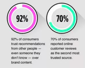
Data backs this up. There have been lots of studies done that highlight how social proof can help sway people to buy.
You’ve probably done this yourself. Most people have asked a friend or family member about a product or service they like. Or you’ll see someone you know and trust on Twitter talk about a certain product which will make you feel more comfortable buying.
This is the same concept behind testimonials on your sales page. You want to highlight real reviews from people who have used your product or service and gotten something positive out of it.
It’s also a great opportunity to highlight the different ways people have used your product of service with success.
For instance, with Location Rebel, one person may have built a development business, while another might have done SEO, or e-commerce.
When you can highlight all of the different approaches and different types of people that are succeeding it has the potential to resonate with a wider audience.
So how do you get these testimonials?
Often you already have them, and if you don’t? Write them yourself.
Just about every testimonial on my sales page has come from an unsolicited email where the user has been writing to thank me for the course or update me on their progress.
So I simply break down the parts I want and respond asking if they mind if I share that particular quote as a testimonial.
Not once has anyone ever said no. The only issue was a guy who hadn’t left his job quite yet (he since has), and didn’t want his full name and photo up there.
But what if your product or service is new and you don’t have these emails?
Find people who have worked with you before, beta users, or anyone else who can vouch for your credibility. Talk to them about what you’re offering, and make notes about what they say.
Afterward, compile the notes, and do the same thing I do. Take the key points, write the testimonial you want, and send it over asking if you’d mind if you used this on your sales page? The vast majority of the time, they’ll be happy to help.
Get as many of these as possible, you can never have too many people saying good things about you.
Here are a few more resources for getting the most out of your testimonials:
- Social Proof: What it is, Why it works, and How to Use it
- 12 Testimonial Page Examples You’ll Want to Copy
- 11 Examples of Great Customer Testimonial Pages
4 Conversion boosting techniques every sales page should have
Once you’ve gotten familiar with Optimize Press and you’re feeling confident building your sales pages, there’s a checklist of things you should always try and include. Whenever possible each of these has been proven to build your reputation, trust, and increase sales.
Money Back Guarantee
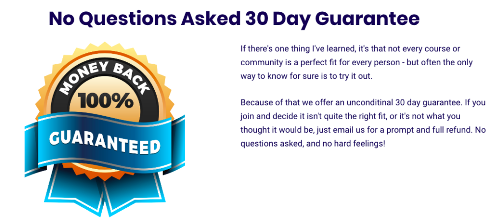
The best thing you can do on your sales page is make it as easy as possible for the buyer to say yes. Take all objections and risk out of the equation. What better way to do that than with a money back guarantee. Make it very clear what the terms are and how easy it is to get a refund if they want it. If they know there’s no risk on their part, obviously, it makes it a lot easier to buy.
Behind the Scenes
Reveal what’s behind the curtain a little bit. Let people know exactly what they’re going to get, and don’t be afraid to show it off! This can be a hugely powerful tool and one that I’ve had multiple people say helped them sway their decision to join Location Rebel Academy.
You can even use the free service Screenr to record your walkthrough.
Add an FAQ Section
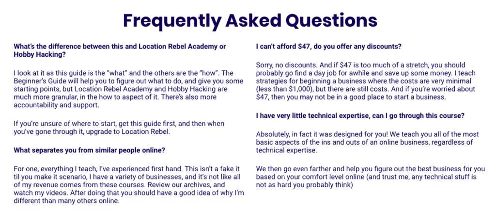
I did this at the end of last year for Location Rebel, and it increased my sales by almost 50%. Just this one little tweak can make a huge difference. Every time I notice I’m getting the same question asked on a regular basis I make a note to update the FAQ, as it is great for handling objections people might have one the spot without need for additional communication
Include a Video
There are all sorts of research that show videos can increase conversion rates. However, on a much more fundamental basis, I like them because it shows there’s a real person behind the product.
I can put myself out there, talk directly to the customer and prove that I do actually exist. When you have no idea who is actually behind a product or service, it can make you very apprehensive to joining. Not to mention, if people already like and trust you, just getting the reaffirmation you’re involved can be valuable.
6 more tips to help you nail your sales page
If you’ve included everything above in your sales page, you’re going to be in good shape. But, there are some special things you can do that make sure your sales page is going to convert and knock it out of the park.
Take a look:
- No navigation: When you create your sales page, you don’t want to include any other navigation buttons. The goal of being on this page is to get people to buy, nothing else. So don’t offer any distractions!
- Good design: Design plays a huge role in any good sales page (more on how to work on your design below). So that means having clearly defined sections that guide your reader through your page and having a page that is user-friendly.
- Short paragraphs: A great copywriter doesn’t need a lot of words to get their point across. People today skim, they don’t really read in depth so make your page skimmable. That means short sentences and paragraphs so there’s lots of white space and it’s friendly to the eye.
- Bold CTA buttons: It’s important for your call to action buttons to stand out. That means both having a good short piece of copy on your button (join now, become a member, etc.) and make your buttons jump out from the page so it’s very easy for someone to click to buy.
- Use images: Images are a part of good design. Images help break up lots of text on your sales page. And, depending on your product or service, can showcase what you’re selling. It’s also a good idea to use images with testimonials when you can.
- Mobile friendly: You have to make sure your sales page is easy to scan on mobile. With over 50% of people using their mobile devices to get online today, you could be missing out on sales.
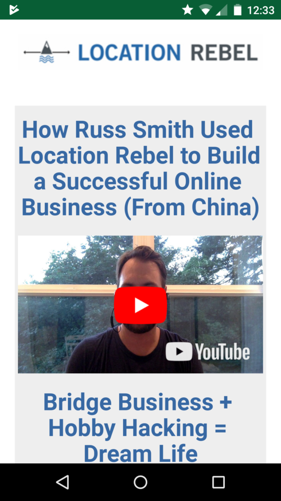
The example above is a video case study landing page that looks good and works easily on mobile.
These tips are going to help you take your sales page to the next level.
How to Test Conversions
We’ve talked about a few different ways to increase conversions on your sales page in this post, but how do you actually do it?
The most basic way is to make sure Google Analytics is installed and that you’re paying attention to where visitors are going and whether or not their buying. It can be a little bit confusing to set up, however, and you’ve got to bet a bit of tech whiz to understand exactly how it all works.
The best service I’ve seen for testing is hands down Visual Website Optimizer. You can easily do everything from change text or colors on a landing page, to split testing two entirely different versions of a page.
It’s $50/month, but they have a free 30 day trial, that is absolutely worth trying out.
I’m not always testing something, but I refuse to give up my account, because of how valuable it is when I am using it.
Max A/B is also a great free WordPress plugin that has an easy to use and understand interface – I just found the results I got weren’t always entirely accurate.
Regardless of what you use, here are some key things you should try testing early on:
- Headlines – Try multiple variations on headlines and see which one leads to more sales/opt ins
- Pricing – What works better 3 price tiers, or just one? High price or low price? Monthly fee or not?
- Buttons – Which color/test/size combination works best?
- Video – Try video vs no video and see which one performs better.
This not enough? Then check out this excellent post at Kissmetrics: 100 Conversion Optimization Case Studies. That should give you plenty to consider 🙂
The best tools for creating sales pages
So you’ve got your content outlined, you’ve got killer headlines brainstormed, testimonials lined up – all that’s left is you have to actually create a good looking sales page.
Unfortunately, this can be easier said than done.
First off, there’s a good chance you already have a site design that isn’t really conducive to creating a sales page.
I’ve spent dozens of hours trying to create sales pages that look good, and I always seem to come up just a little bit short. The tools out there for helping the less technically inclined are relatively few and far between.
Now there’s a slew of tools out to help people create better sales pages. Leadpages, Optimize Press, Unbounce, Instapage (and more), all of them have one goal – to help you convert more sales and generate more leads.
Over the years, I’ve been able to use a few of these as I’ve tried to improve the LR sales pages and have settled on two primary tools, Optimize Press and LeadPages, so those are the two I’m going to dig into a bit here.
Optimize Press
For a long time on the site, we’ve used Optimize Press 2.0 and it’s worked really well.
Unlike Leadpages, where the pages sit on a hosted site, OP is a plugin that works on WordPress. That helps it feel a bit more familiar to people, especially those who are starting out. OP also is a lot cheaper than Leadpages, with only a one time fee for it.
One of the really unique features of it, that I don’t think any other landing page builder has, is it can help you create membership portals and sites. If you’re thinking of building a membership site, that’s something to keep in mind. It works with lots of existing membership plugins and can be used to create packages and even drip out content to members.
Another big benefit that helps for beginners is it doesn’t have a really steep learning curve and they offer lots of documentation and support.
More features:
- Responsive design that’s mobile friendly
- Integrations are available, but double check which ones work, some are incompatible
- Allows you to create membership levels and packages
- Live editor to see how your site looks in real time
- 30+ templates to work with
- Custom elements so you can include everything from headlines to images to audiofiles on your page
Leadpages
Recently, with the new changes to LR, we’ve started tinkering with Leadpages and I have to say, I’ve been really impressed with the results.
Leadpages is probably one of the more expensive options out there, but you do get a lot of bang for your buck with it.
One of the features I’ve been most impressed with is the template library. After making a lot of sales pages over the year, just getting the formatting right can take hours.
With the template library, Leadpages makes it about as easy as possible, and you can actually sort the templates via conversion rate and type from sales page to landing page to ebook option, which is pretty cool. And the library is huge, it has over 100 options to choose from.
But that’s not the only thing I’ve been impressed by when it comes to Leadpages.
More features:
- Responsive so it is mobile friendly
- Drag and drop editing that makes it easy to make your page look nice with no coding needed
- Lots of integrations, easy to set up with your email service provider, PayPal, Stripe, etc.
- A/B testing for headlines, buttons, etc.
- Analytics so you can see how your page is performing
- Hosted landing page (but you can use your own domain name for it)
Set Aside Some Time to Tinker
Regardless of which tool you choose, you need to plan to give it at least a few hours to really understand how it works and get fast with it.
Take your outline, and start with the headline. Start importing it in, get a feel for adding elements, dragging and dropping and so on. It will take a little bit of time to get the feel of things, but once you get your first page done and know the lay of the land, each additional page you create is going to be a lot quicker.
I honestly, can’t recommend either of these enough. They give you full freedom to customize, without having to take over your entire site. If you want to really level up your sales and landing pages, you really need to check these out. You can go wrong with either option!
A Few More Posts Comparing Landing Page Builders:
- The 10 Best Landing Page Builders to Make One Page Websites
- The 10 Best Landing Page Builder Software Tools
- 5 Best Sales Funnel Software Programs to Get You Started Making Money Online
Other Location Location Rebel Posts You Should Check Out:
- How to Build a Membership Site in 48 Hours – If you’re building a sales page there’s a good chance it’s for an information product or membership site. Use this as a resource for building that out.
- How to Create a Killer List Building Offer – If you aren’t just using one simple sales page, and have a dedicated funnel, this is a really valuable post that will help you get more people onto your list and into your sales funnel.
- Everything I’ve Learned About Email Marketing – Once they’re on your list, you’ve gotta warm them up to the idea of the product before sending them over to the sales page. This should get you going.
There You Have It…
There you have it, everything you need to know to get started working on your first sales page or revamping a current one. It’s going to take some time and effort to get it exactly where you want it, but with the tools recommended, and a little planning the energy investment is going to be well worth it.
What have I missed? What other critical aspects are there for building a sales page?
Sean Ogle
Sean Ogle is the Founder of Location Rebel where he has spent the last 12+ years teaching people how to build online businesses that give them the freedom to do more of the things they like to do in life. When he's not in the coffee shops of Portland, or the beaches of Bali, he's probably sneaking into some other high-class establishment where he most certainly doesn't belong.Join over 40,000 people who have taken our 6 part freelance writing course. Sign up below and let’s do this together.
By entering your email address you agree to receive emails from Location Rebel. We'll respect your privacy and you can unsubscribe at any time.
